The 7-Block Homepage That Converts (With Wireframes)
The 7-Block Homepage That Converts (With Wireframes)
A great homepage doesn’t try to say everything. It creates momentum. In a few intentional “blocks,” it earns attention, answers the right questions in the right order, and moves a qualified visitor to take one next step. Think of it as a guided tour: you greet, you reassure, you explain, you show, you remove doubt, and you invite.
ALSO, READ Entity SEO & Topical Authority: 90-Day Plan
This guide gives you a complete, copy-first blueprint for a conversion-focused homepage arranged into seven blocks. You’ll get the psychology behind each block, detailed writing prompts, visual layout notes for desktop and mobile, and pitfalls to avoid. By the end, you’ll be able to sketch a wireframe on paper and hand it to any designer or builder and get a page that’s fast, persuasive, and easy to navigate.
Why seven blocks?
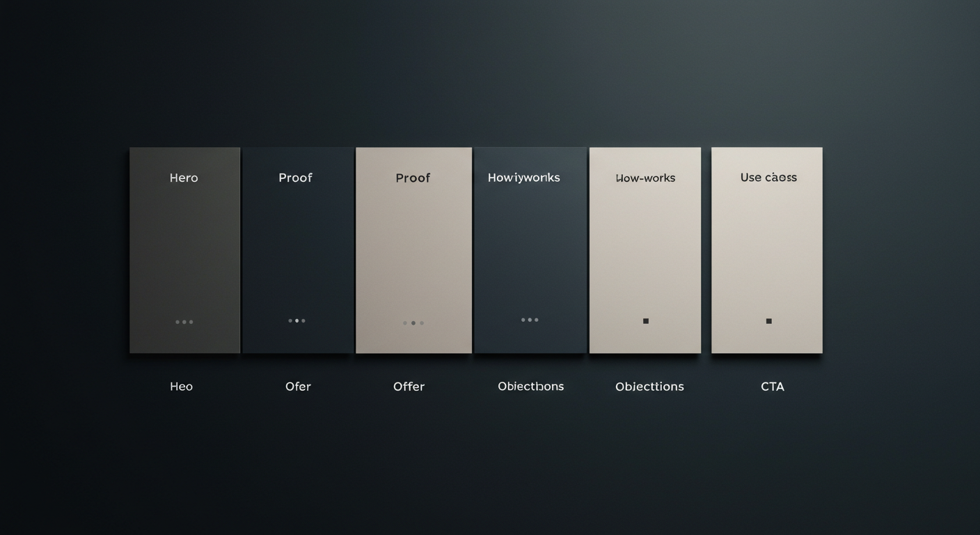
Because seven is just enough to cover what matters without bloat. Many homepages drown readers in sliders, random sections, and “stuff we had to put somewhere.” When you reduce the canvas to seven purposeful blocks, every pixel starts earning its keep:
- Hero – your promise and the immediate next step.
- Proof – social proof and credibility (logos, ratings, numbers).
- Offer – what you actually do and the core benefits.
- How-It-Works – your process/mechanism in 3–5 steps.
- Use Cases – where your offer fits real life (industries, roles, scenarios).
- Objections – price, risk, time, complexity, trust—answered.
- CTA – a clean, friction-light invitation and secondary paths; footer utility.
Notice that this sequence follows how minds process decisions on first contact: promise → legitimacy → value → understanding → relevance → reassurance → action.
Ground rules before you design anything
- Decide the one thing you want from this page. Book a call? Start a free trial? Get a quote? Your primary CTA should be consistent in the hero and in the final block.
- Write first, design second. If you can’t write a headline in 6–10 words and a subhead in 20–35, you don’t yet know your promise.
- Keep the path short. Don’t make visitors choose from six CTAs. Give one primary action and one safety-valve secondary action (e.g., “See Pricing” or “Watch 90-sec demo”).
- Mobile matters more. Design every block for a narrow viewport first; then let it breathe on desktop.
- Clarity beats cleverness. If a stranger cannot read just the headlines and understand what you do, the page is failing.
Block 1: HERO — The promise and the path
Job: Capture attention in 3 seconds, convey your core promise, and offer a zero-confusion next step.
Psychology at play: The primacy effect (people remember the first thing they see), processing fluency (low friction feels more true), and commitment (a small, clear step increases the chance of a bigger one).
Copy kit:
- Headline: 6–10 words. Avoid fluff; state the outcome.
- “Launch secure, blazing-fast sites—without extra headcount.”
- “Book more qualified demos—straight from your homepage.”
- Subhead: 20–35 words expanding the promise and hinting at the mechanism.
- “A conversion-engineered site framework with built-in speed, SEO, and lead capture. From wireframe to launch in 21 days—measured, tested, and scalable.”
- Primary CTA: verb + outcome (2–3 words).
- “Get a Quote”, “Start Free Trial”, “Book a Strategy Call”.
- Secondary micro-CTA: a low-commitment alternative.
- “Watch 90-sec demo”, “See sample sites”, “View pricing”.
Visuals: One focused, relevant visual that makes the promise tangible: product UI close-up, a short looping demo, an outcome-oriented photo (not generic stock smiles).
Wireframe you can picture (desktop):
Top bar with logo left, minimal nav right (3–5 items, plus the CTA button). Below it, a wide hero area is split into two columns: the left column carries a headline, subhead, and primary CTA with a small line of risk-reducer text under it (“No credit card • Cancel anytime”); the right column shows the product image/video or service outcome proof. Under the hero, a thin trust strip with 4–6 well-known client logos or a star-rating badge.
ALSO, READ Programmatic SEO for Service Businesses (Ship 1,000 Pages)
Wireframe (mobile):
Logo + compact hamburger. Headline stacks over subhead, then a large full-width CTA button, then the trust strip, then the visual (autoplay muted video is fine if subtle). Keep the hero height to 1.5–2 screenfuls max.
Common mistakes to avoid:
- Slider carousels (split attention; poor CLS).
- Multiple primary CTAs (no, “Contact”, “Sign Up”, and “Download” cannot all be primary).
- Buzzwords that don’t name the outcome.
Block 2: PROOF — Credibility that sticks
Job: Reduce skepticism quickly with recognizable signals of trust.
Psychology at play: Social proof and authority bias. People take cues from the crowd and from experts.
Pick your proof style:
- Logo belt: recognizable brands; keep color subdued or grayscale to avoid visual noise.
- Numbers: cumulative results (“2,100+ launches”), speed (“<200ms TTFB”), ratings (“4.9/5 from 312 reviews”).
- Short testimonial: 1–2 lines with a headshot and name/title. If you can, pair a number with the quote (“+37% demo bookings in 30 days”).
- Badges: certifications, compliance, awards—only if they truly influence purchase (ISO, SOC 2, NDPR/GDPR, etc.).
Wireframe (desktop):
A slim band just under the hero: a centered heading like “Trusted by growth-focused teams” followed by a tidy row of logos. Below, a second row with three small “stat cards” (number + one-line label) or a rotating testimonial that fades gently (no sliding).
Wireframe (mobile):
Two rows of logos (3 per row), then a vertical stack of 2–3 stat cards, then one testimonial with a headshot.
Copy tip: State the context of numbers. “4.9/5 based on 312 verified client reviews (Jan–Aug 2025).” Specificity reads as truth.
Mistakes to avoid:
- Fake or outdated logos.
- Overstuffed proof blocks that feel like a brag wall. Minimal is powerful.
Block 3: OFFER — What you do and why it’s valuable
Job: Explain the offer with benefits first, then features as proof of those benefits.
Psychology at play: People buy outcomes, not ingredients. The brain scans for “does this solve my problem” before it cares how.
Structure your offer block:
- Intro sentence: One line that clearly states what you sell.
- “We design and build conversion-ready websites for service brands.”
- “A managed platform that keeps your WordPress secure, fast, and scalable.”
- Three core benefits: short headlines with a single line of explanation each.
- “Faster loads on mobile” — “Image CDNs, preloaded fonts, and clean templates keep you 90+ on Core Web Vitals.”
- “Search-ready structure” — “Entity-based schema, topic clusters, and internal links out of the box.”
- “Built to convert” — “Homepage and landing patterns tested across 100+ launches.”
- Support visuals: a trio of screenshots, diagrams, or photos, each labelled.
Wireframe (desktop):
Section title centered, followed by a three-column layout: each column holds a benefit headline, a one-line explainer, and an icon/mini-visual. Under the three benefits, a horizontal strip with three feature bullets (short phrases) anchors to deeper pages if needed.
Wireframe (mobile):
Benefits stack vertically, each with a small accompanying icon and a divider line for rhythm. Keep each explanation to one short sentence.
Copy tip: Replace adjectives with specifics. “Blazing-fast” becomes “90+ mobile CWV, typical TTFB < 200ms.” “Easy” becomes “No code, publish in minutes.”
Mistakes to avoid:
- Feature lists longer than eight bullets (nobody reads them).
- Tech jargon without outcome translation.
ALSO, READ Zero-Click SEO in 2025: AI Overviews & Snippet Wins
Block 4: HOW-IT-WORKS — Your mechanism in five calm steps
Job: Reduce perceived complexity by showing a simple path from “today” to “win.”
Psychology at play: Cognitive load reduction and the Zeigarnik effect (we like to finish sequences we start).
Five-step outline (adapt to your service):
- Discover – brief call, goals, constraints.
- Blueprint – wireframes, messaging, success metrics.
- Build – design, content, integration, QA.
- Launch – speed checks, tracking, handover.
- Improve – A/B tests, content velocity, roadmap.
Wireframe (desktop):
A left-to-right horizontal timeline with five numbered circles. Each number opens a one-sentence caption. Under the timeline, a slim “What we need from you” box with 3–4 items (logo files, access, point of contact), and a friendly note on typical timelines (“21 days to launch”).
Wireframe (mobile):
A vertical list of five steps with small numbered badges and concise one-sentence descriptions. Keep the “What we need” box as a shaded card between steps four and five.
Copy tip: Use present tense and second person (“You’ll get… We’ll handle…”) to make the steps feel imminent and concrete.
Mistakes to avoid:
- Overexplaining each step (save depth for a linked Process page).
- Hiding timeframes—you look evasive.
Block 5: USE CASES — Show where the offer fits
Job: Help visitors recognize themselves. When they see their situation, they lean in.
Psychology at play: Self-referencing and category fit. If I can place your solution in my world quickly, I’ll keep reading.
Pick one of these patterns:
- By industry: “Clinics, law firms, education, hospitality, SaaS.”
- By role: “Marketing leaders, founders, IT managers, SEO teams.”
- By scenario: “New launch, redesign, speed rescue, security hardening.”
Wireframe (desktop):
A grid of 4–6 tiles. Each tile has a short headline (“For Clinics”) and a single benefit line (“Reduce no-shows with faster booking flows”). Clicking a tile leads to a focused page or reveals a small drawer with more details.
Wireframe (mobile):
Tiles stack; each tile expands accordion-style to show 2–3 bullets and a small testimonial relevant to that use case.
Copy tip: Use the customer’s vocabulary. If clinics say “no-shows,” use “no-shows,” not “appointment adherence optimization.”
Mistakes to avoid:
- Overlapping use cases that confuse categories.
- Vanity “industries we could maybe serve” with no proof. Keep it honest.
Block 6: OBJECTIONS — Remove friction before it stalls action
Job: Neutralize the top five reasons people hesitate: price, time, trust, complexity, and regret.
Psychology at play: Loss aversion (fear of a bad decision) and risk reversal.
What to include:
- FAQ mini-section: five crisp Q&As.
- “How much does it cost?” → “Most projects land between ₦X–₦Y. Get an exact quote in 24 hours.”
- “How fast can we go live?” → “Standard launch in 21 days; rush option available.”
- “Who owns the site?” → “You own everything. Full admin access and source files.”
- “What about support?” → “Month-to-month; cancel any time.”
- “Is it secure?” → “WAF, 2FA, automated backups, audits—documented.”
- Guarantee or safety net: e.g., “No-surprises pricing,” “30-day risk-free trial,” “Pay-on-milestones.”
- Compliance or assurances: NDPR/GDPR, HIPAA, SOC, SSL—relevant to your buyers.
- A short trust story: one paragraph “how we work” tone piece that signals integrity and craft.
Wireframe (desktop):
Two columns. Left: the top five FAQs in an accordion with short answers. Right: a shaded box with the guarantee and a tiny line of legal clarity. Beneath, a horizontal strip with two customer headshots + one-line praise each.
Wireframe (mobile):
Accordion only. The guarantee box appears after the first or second FAQ to catch eyes mid-scroll.
Copy tip: Keep answers under 60 words. If it needs more, link to a deep FAQ page.
Mistakes to avoid:
- Weasel words (“may,” “might,” “in most cases”) where buyers need certainty.
- Hiding the price conversation entirely.
Block 7: CTA — A clean, confident close (with footer utility)
Job: Convert momentum into action and provide a soft landing for researchers.
Psychology at play: Goal gradient effect—people speed up as they approach a finish line. Your final block should feel like the finish line.
Elements:
- Short headline: “Ready to launch?” or “Let’s build the homepage that sells.”
- One sentence of benefit reminder: “Conversion-engineered, search-ready, and fast—delivered in 21 days.”
- Primary CTA button: same as the hero; don’t switch verbs.
- Secondary path (small text link): “See pricing,” “Watch 90-sec demo,” or “Talk to an expert.”
- Contact options: phone, WhatsApp, email—inline icons (no clutter).
- Footer: compact navigation (About, Process, Pricing, Blog, Careers, Privacy/Terms), location(s), and social. Keep it thin and unintrusive.
Wireframe (desktop):
Centered content with generous white space: headline, subline, big button, small safety-valve link beneath it. Footer sits below with subdued typography and high contrast for legibility.
Wireframe (mobile):
Same order. Make the primary button full-width. Keep the footer to two concise columns or a single list with adequate spacing.
Copy tip: Add one friction-reducing line under the button: “No hard sales pitch—just an honest 15-minute walkthrough.”
Mistakes to avoid:
- Adding new CTAs that weren’t present in the hero.
- Burying contact info or hiding behind forms.
The reading path and why the order matters
A homepage is scanned, not studied. Visitors typically follow a Z-pattern on desktop (logo → nav/CTA → mid-hero → bottom right) and an F-pattern on mobile (headline → subhead → first button → subsequent headings). Our seven blocks sequence respects this scanning behavior:
- The Hero earns attention and offers a decision.
- Proof immediately resolves the “Can I trust them?” loop.
- Offer answers “What do they actually do?”
- How-It-Works turns a foggy process into “I can see the path.”
- Use Cases trigger self-identification: “This is for me.”
- Objections remove the last sources of friction.
- CTA capitalizes on momentum.
If you reorder these sections wildly, you ask readers to work harder than necessary. Keep the spine; experiment with depth inside each block.
Writing prompts (paste into your doc)
Hero prompts:
- Our audience’s painful status quo in 6 words: _______.
- The after state in 6 words: _______.
- One sentence that proves we can do it (mechanism): _______.
- Primary CTA verb + outcome: _______.
- What can we promise in 21–30 days? _______.
Proof prompts:
- Our three strongest numbers: ______ / ______ / ______.
- Two logos that matter most to our buyers: ______ / ______.
- One line our happiest client actually said: “_______.”
Offer prompts:
- In one sentence, what do we sell? _______.
- Three benefits (headline + one line):
- ______ — ______
- ______ — ______
- ______ — ______
How-It-Works prompts:
- List five steps in present tense: 1) ______ 2) ______ 3) ______ 4) ______ 5) ______
- Timeframe and what we need from clients: ______ / ______ / ______.
Use-Case prompts:
- Which industries/roles/scenarios do we serve best? ______ / ______ / ______ / ______.
- What outcome do we deliver in each? ______ / ______ / ______ / ______.
Objection prompts:
- Price: What’s the honest range? _______.
- Time: what’s the honest timeline? _______.
- Trust: what proves we’re safe to choose? _______.
- Complexity: What do we handle for them? _______.
- Regret: what’s the guarantee or safety net? _______.
CTA prompts:
- Closing line that restates the win: “_______.”
- Reassurance line under button: “_______.”
Accessibility, performance, and UX polish (don’t skip)
- Readable type: 16–18px base on desktop, 15–16px on mobile, strong contrast.
- Button labels: verbs that say what happens next (“Get a Quote”), not nouns (“Quote”).
- Alt text: describe function, not just appearance. For a hero video thumbnail: “Short demo of the booking flow increasing conversions.”
- Core Web Vitals: compress images, avoid layout shift (fixed image dimensions, careful with fonts), delay non-essential scripts.
- Focus states and keyboard nav: visitors should tab through CTAs comfortably.
- Form friction: minimize fields; progressively reveal extra questions; add inline success messages.
Variations by business type
For service businesses and agencies:
- Emphasize time to value in hero and how-it-works.
- Use before/after” visuals and job counts in the proof block.
- In objections, clarify ownership, billing, and support cadence.
For SaaS:
- Hero CTA: “Start free trial” or “Watch demo.”
- Offer block uses benefit → feature mapping (“Fewer no-shows → automated reminders”).
- How-it-works becomes “Setup in minutes” with screenshots.
- Objections must address data security and integrations.
For professional services (law, medical, consulting):
- Swap the demo video for a short, calm video introduction from the principal.
- Proof: focus on accreditations and case outcomes (ethically framed).
- Objections: compliance (NDPR/GDPR/HIPAA), confidentiality, and fees explained plainly.
A one-hour sketch exercise (do this today)
- Fold a sheet of paper into seven horizontal bands.
- Label them: Hero, Proof, Offer, How-It-Works, Use Cases, Objections, CTA.
- In each band, write only headlines and CTA labels—no body copy.
- Show it to someone who isn’t in your business. Ask them to read only the headlines.
- If they can’t tell you what you do and what to do next, fix the headlines before you write anything else.
- Once headlines work, add one-line subheads per block.
- Only then sketch visuals (one per block).
Troubleshooting: why your current homepage doesn’t convert
- The headline is about you, not them. “We are a leading…” is not a promise.
- Too many roads. If every nav item looks like a CTA, none of them are.
- No proof above the fold. A trust strip right under the hero can lift conversions immediately.
- No mechanism. Without a simple 3–5 step process, buyers assume complexity.
- Objections ignored. If you don’t answer price, speed, or safety, visitors assume the worst.
- CTA mismatch. The hero says “Start Free Trial,” but the closing block says “Contact Sales.” Keep it consistent.
- Visual noise. Sliders, stock photos, and high-contrast backgrounds compete with your message.
- Slow or jumpy. Layout shift and sluggish pages leak trust.
A complete homepage in words (a descriptive wireframe)
Hero:
A calm, high-contrast headline reads, “Launch a conversion-ready site in 21 days.” A single sentence below expands: “Speed, SEO, and design—done for you with a battle-tested framework.” A full-color button says “Get a Quote,” and just under it, small text promises, “No sales pitch—15 minutes to scope your project.” On the right, you see a crisp product still or a silent looping clip of the editor publishing a page in seconds. Across the bottom edge of the hero, four grayscale client logos sit in a tidy row.
Proof:
A short line centered on the page: “Trusted by teams that need results fast.” Beneath it, two rows of familiar logos in grayscale. Below the logos, three compact stat cards: “4.9/5 average rating,” “2,100+ launches,” “TTFB < 200ms.”
Offer:
A large section title: “What you get.” Three evenly spaced columns follow. Column one reads “Conversion-first design,” with a single sentence: “Wireframes and sections proven to turn visits into leads.” Column two: “Search-ready structure,” one sentence: “Entities, schema, and clusters built into your site.” Column three: “Speed and security,” one sentence: “Image CDNs, caching, and hardening baked in.” Underneath the three columns, a thin row offers three short feature anchors: “Accessible by design,” “Analytics wired,” “Easy updates.”
How-It-Works:
A horizontal sequence of five numbered circles runs across the page, connected by a thin line. Under each number is a short title and a single sentence: Discover (goals and constraints), Blueprint (wireframes and copy), Build (design and content), Launch (QA and handover), Improve (A/B and content). A shaded box under the line says, “What we need from you,” followed by three tags: “Brand files,” “One point of contact,” “Access to existing tools.”
Use Cases:
A grid of six cards fills the next section. The cards say, “For SaaS,” “For Clinics,” “For Law Firms,” “For Education,” “For Agencies,” “For Hospitality.” Each card carries one line tailored to that world: “Double demo bookings from your homepage,” “Cut no-shows with faster mobile booking,” and so on. Clicking a card reveals three bullets or links to a focused page.
Objections:
Five accordion questions span the width: “How much does it cost?” “How fast is a typical launch?” “Who owns the site?” “What about support?” “Is it secure?” Answers are short and plain. To the right sits a small box with a calm line: “No-surprises pricing. You’ll see a scoped quote and a milestone plan before we start.” Underneath sit two headshots with one-line quotes.
CTA:
Centered, with whitespace: “Ready to launch?” A sentence: “Get a conversion-ready site in 21 days—fast, secure, and search-ready.” A single bold button: “Get a Quote.” A light link beneath: “See pricing.” The footer shows a slim navigation (About, Process, Pricing, Blog, Careers, Privacy/Terms) and contact details.
Read those paragraphs out loud and you’ll notice something: you can feel the page. That’s what a good wireframe should do.
Final checklist (print and tick)
- The hero headline names an outcome in 6–10 words.
- There is one primary CTA in hero and final block (identical label).
- A trust strip sits immediately under the hero.
- The offer is benefits-first, features as proof.
- The process is five steps, present tense, one sentence each.
- Use cases map to actual buyers; each has a concrete outcome line.
- Objections answer price, speed, ownership, support, security—clearly.
- The closing CTA repeats the primary action; a secondary path exists but is visually lighter.
- Mobile layout is reviewed for scanability and tap targets; images are compressed; forms are short.
- Alt text, headings, and contrast pass accessibility checks.
- Analytics events are defined for the primary CTA and the secondary path.
One last nudge
A homepage is not a museum of everything you do; it’s a starting point for the journey you want buyers to take. When you reduce it to these seven blocks and you write each block with ruthless clarity, you stop hoping for conversions and start engineering them.
If you’d like, tell me your product/service, your primary CTA, and your top two use cases. I’ll draft the headlines, subheads, and microcopy for each of the seven blocks so you can drop them straight into your builder.
FAQS
What is the 7-block homepage framework?
It’s a conversion-focused layout that moves visitors from promise to action in seven sections: Hero, Proof, Offer, How-It-Works, Use Cases, Objections, and CTA.
Should my hero include a slider?
No. Sliders split attention and hurt Core Web Vitals. Use one clear visual and a single primary CTA.
How many CTAs should I show?
One primary action repeated (hero and footer CTA) plus one lighter secondary path (pricing, demo, or contact). More options increase friction.
Where do I show the price?
Answer the price question in the Objections block with a range or a link to pricing. Hiding it entirely can reduce trust and inquiries.
What makes good social proof?
Recognizable logos, recent ratings with counts and dates, and short-named testimonials. Keep it minimal and credible.
How long should the page be?
As long as it needs to answer the right questions in that order. Use clear headings, jump links, and concise copy to keep scrolling intentional.
Can this replace landing pages?
It complements them. Your homepage sets the brand narrative; targeted landing pages handle specific campaigns and offers.