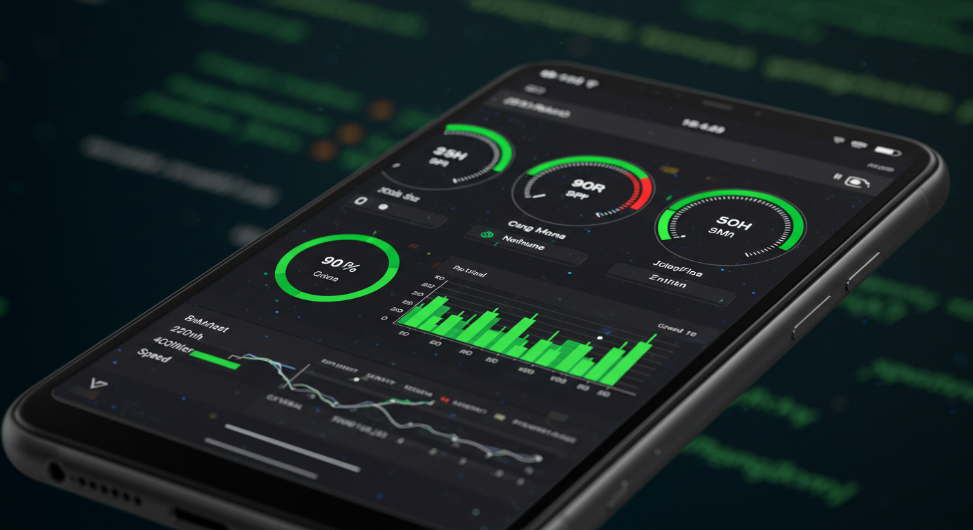
Core Web Vitals Playbook: How to Hit 90+ on Mobile
Core Web Vitals Playbook: How to Hit 90+ on Mobile
Introduction: The Mobile Performance Imperative
In today’s digital landscape, mobile performance isn’t just a nice-to-have feature—it’s a critical ranking factor that directly impacts your search visibility, user experience, and ultimately, your bottom line. Google’s Core Web Vitals have transformed how we approach website optimization, making it essential for developers, marketers, and business owners to understand and master these metrics.
ALSO, READ
Achieving a score of 90+ on mobile devices might seem daunting, but with the right strategies and implementation techniques, it’s entirely achievable. This comprehensive playbook will walk you through every critical element needed to optimize your website’s Core Web Vitals, from image delivery systems to cumulative layout shift prevention, font optimization, and intelligent caching strategies.
Understanding Core Web Vitals: The Foundation
Before diving into optimization techniques, it’s crucial to understand what Core Web Vitals measure and why they matter. Google’s Core Web Vitals consist of three primary metrics that evaluate different aspects of user experience:
Largest Contentful Paint (LCP) measures loading performance and specifically tracks how long it takes for the largest content element visible in the viewport to render. Google considers an LCP of 2.5 seconds or less as good performance. This metric directly correlates with user perception of page load speed.
ALSO, READ Zero-Click SEO in 2025: AI Overviews & Snippet Wins
First Input Delay (FID), which is being replaced by Interaction to Next Paint (INP), measures interactivity and responsiveness. It tracks the time from when a user first interacts with your page to when the browser can actually respond to that interaction. A good FID score is less than 100 milliseconds, while INP should be below 200 milliseconds.
Cumulative Layout Shift (CLS) measures visual stability by quantifying how much unexpected layout shifts occur during the page’s lifespan. A good CLS score is less than 0.1. This metric prevents the frustrating experience of clicking on something only to have the page shift and register a different action.
Mobile devices face unique challenges that make hitting high scores more difficult. Limited processing power, variable network conditions, smaller screens, and touch-based interactions all contribute to the complexity of mobile optimization. However, mobile-first indexing means Google primarily uses the mobile version of your site for ranking, making mobile optimization absolutely critical.
Image CDNs: The Performance Game-Changer
Images typically account for the majority of page weight, making them the single biggest opportunity for performance improvements. A robust image Content Delivery Network (CDN) strategy is fundamental to achieving 90+ scores on mobile devices.
Choosing the Right Image CDN
Modern image CDNs like Cloudinary, imgix, Cloudflare Images, and ImageKit offer sophisticated transformation capabilities that go far beyond simple file delivery. These platforms provide automatic format selection, intelligent compression, responsive image generation, and global edge caching—all crucial for mobile performance.
When selecting an image CDN, prioritize platforms that offer automatic WebP and AVIF format conversion. These next-generation formats provide 25-35% better compression than JPEG while maintaining visual quality. Your CDN should detect browser capabilities and serve the optimal format automatically.
Implementing Responsive Images
The <picture> element and srcset attribute are essential tools for delivering appropriately-sized images to different devices. Here’s the fundamental approach:
ALSO, READ Entity SEO & Topical Authority: 90-Day Plan
First, generate multiple image versions at different resolutions. A typical strategy includes versions at 320px, 640px, 1024px, 1366px, and 1920px widths. Your image CDN should handle this automatically through URL parameters.
Use srcset to define these versions and let the browser choose the appropriate size based on device capabilities and viewport width. Combine this with the sizes attribute to give the browser hints about how much space the image will occupy in different layouts.
The loading="lazy" attribute is non-negotiable for below-the-fold images. This native browser feature defers loading images until they’re near the viewport, dramatically reducing initial page weight and improving LCP for above-the-fold content.
Critical Image Optimization Techniques
For your LCP element—often a hero image—special handling is required. This image should never be lazy-loaded. Instead, use fetchpriority="high" to tell the browser this resource is critical. Preload this image in your document head to initiate the download as early as possible.
Image compression settings require careful balance. Quality settings between 75-85 typically provide the sweet spot where file size reductions are significant but visual degradation is imperceptible on mobile screens. Your CDN should allow quality parameters in the URL for easy A/B testing.
Implement automatic format negotiation through proper Accept headers. Modern CDNs examine the browser’s Accept header and serve WebP to Chrome and Edge, AVIF to browsers that support it, and fall back to JPEG or PNG for older browsers—all transparently.
Advanced Image CDN Features
Take advantage of smart cropping and focal point detection. Modern CDNs use AI to identify important regions of images and automatically crop responsively-sized versions to maintain the key subject matter. This prevents faces or important elements from being cut off on mobile devices.
Use blur-up or low-quality image placeholders (LQIP) to improve perceived performance. Load a tiny, highly compressed version of the image immediately (often 20-50 bytes), then transition to the full-resolution version. This gives users immediate visual feedback while the full image loads.
Consider implementing progressive JPEGs for larger images. These render in increasing quality passes, showing a complete but low-quality version quickly, then refining the details. This provides better perceived performance than baseline JPEGs that load top-to-bottom.
CLS-Safe UI: Building Stable Layouts
Cumulative Layout Shift is often the most challenging Core Web Vital to optimize, particularly on mobile devices where dynamic content and ads are common. Building CLS-safe interfaces requires deliberate design and development practices.
Reserve Space for Dynamic Content
The fundamental principle of preventing layout shift is reserving space for every element before it loads. This applies to images, videos, ads, embeds, and dynamically injected content.
For images and videos, always specify explicit width and height attributes in your HTML. Modern browsers use these to calculate aspect ratio and reserve the appropriate space before the media loads. The CSS aspect-ratio property provides additional control for responsive scenarios.
Set minimum heights for ad slots and other dynamic content areas. Even if the exact content dimensions aren’t known, reserving approximate space prevents major shifts. Use skeleton screens or placeholder boxes that match the expected content dimensions.
Font Loading Strategies
Web fonts are a major source of layout shift through the “flash of invisible text” (FOIT) or “flash of unstyled text” (FOUT) phenomena. Implement proper font loading strategies to minimize CLS impact.
Use font-display: swap as your baseline approach. This shows fallback fonts immediately while custom fonts load, preventing invisible text. However, ensure your fallback fonts match the dimensions of your custom fonts as closely as possible to minimize the shift when fonts swap.
The @font-face descriptor size-adjust property allows you to scale fallback fonts to match custom font metrics. Calculate the ratio between your custom font’s metrics and the fallback, then apply size-adjust to the fallback to minimize the shift during font swapping.
ALSO, READ The 7-Block Homepage That Converts (With Wireframes)
Consider using variable fonts when possible. These single font files contain multiple weights and styles, reducing the number of font requests and potential for layout shifts from multiple font loads.
Handling Third-Party Content
Third-party scripts and embeds are notorious CLS offenders. Social media widgets, advertising networks, and analytics scripts often inject content without dimension information, causing significant shifts.
For social media embeds, use the oEmbed API to fetch embed dimensions before rendering, or use static placeholder images with known dimensions that transform into live embeds on interaction.
Implement lazy-loading for third-party embeds below the fold. Tools like Intersection Observer can trigger embed loading only when users scroll near them, preventing shifts from occurring during initial page load when CLS is measured most critically.
Use facade patterns for heavy third-party content like YouTube embeds. Show a static thumbnail with a play button that loads the actual embed only when clicked. This eliminates all layout shifts from the embed while maintaining functionality.
Animation and Transition Best Practices
Animations themselves can cause layout shifts if not implemented correctly. Use CSS transforms and opacity for animations instead of properties that trigger layout recalculation like width, height, top, or left.
The transform and opacity properties are GPU-accelerated and don’t cause reflow or repaint in surrounding elements. Use transform: translateX() instead of changing left, and transform: scale() instead of changing width and height.
For expanding or collapsing elements, use max-height transitions with overflow hidden rather than animating the height property directly. While not perfect, this approach provides smoother animations with less layout impact.
Always animate with will-change or create a new stacking context using transform: translateZ(0) for elements that will animate. This tells the browser to optimize the element for animation, reducing the likelihood of layout shifts affecting surrounding content.
Responsive Design Considerations
Mobile devices present unique CLS challenges due to varied viewport sizes and orientations. Design your responsive breakpoints to minimize content reflow during the initial load.
Avoid changing layout substantially in JavaScript after page load. All major layout decisions—sidebar positions, column counts, etc.—should be determined by CSS media queries that execute before rendering, not JavaScript that executes after.
Test thoroughly on actual mobile devices, not just browser DevTools. Real devices often exhibit different behavior due to slower processors, different font rendering, and actual network conditions. Use tools like Chrome’s remote debugging to inspect CLS issues on physical devices.
Implement proper viewport meta tags to prevent unexpected zooming and scaling that can cause layout shifts. The standard <meta name="viewport" content="width=device-width, initial-scale=1"> prevents many mobile-specific layout issues.
Font Optimization: Speed and Stability
Typography significantly impacts both performance and layout stability. Comprehensive font optimization addresses file sizes, loading strategies, and preventing layout shifts during font swaps.
Choosing and Subsetting Fonts
Font file selection has massive performance implications. A single font family with multiple weights and styles can easily exceed 500KB, devastating mobile load times. Strategic subsetting and format selection are essential.
Use modern font formats exclusively. WOFF2 provides approximately 30% better compression than WOFF and should be your primary format. Drop support for older formats like TTF or EOT—browsers that don’t support WOFF2 are negligible in market share.
Subset fonts aggressively to include only the characters you actually use. If your site is English-only, you don’t need Cyrillic, Greek, or Asian character sets. Tools like glyphhanger can analyze your actual content and generate minimal subsets.
Consider using system fonts for body text and custom fonts only for headings and key branding elements. System fonts load instantly, have zero network cost, and feel native to users. The -apple-system, BlinkMacSystemFont, "Segoe UI", Roboto font stack covers nearly all devices beautifully.
Preloading and Self-Hosting Strategies
Self-hosting fonts provides complete control over delivery and eliminates third-party requests. Download your web fonts and serve them from your own CDN or origin server.
Preload critical fonts in your document head using <link rel="preload" as="font" type="font/woff2" crossorigin href="/fonts/font.woff2">. This initiates the font download during HTML parsing rather than waiting until CSS is parsed and applied.
Only preload fonts used above the fold for heading or prominent text. Preloading too many fonts negates the benefits by consuming bandwidth needed for other critical resources.
The crossorigin attribute is required for font preloading even when self-hosting from the same origin due to how browsers handle CORS for font requests. Omitting this prevents the preload from working.
Google Fonts Optimization
If using Google Fonts, optimize the implementation to minimize performance impact. The standard embed code can be improved significantly.
Use the &display=swap parameter in your Google Fonts URL to ensure immediate text rendering with fallback fonts. This prevents invisible text during font loading.
Self-host Google Fonts using tools like google-webfonts-helper for maximum control and performance. This eliminates the extra DNS lookup, connection, and request to Google’s servers.
If you must use Google Fonts hosted solution, implement resource hints. Add <link rel="preconnect" href="https://fonts.googleapis.com"> and <link rel="preconnect" href="https://fonts.gstatic.com" crossorigin> to your document head to establish early connections.
Fallback Font Matching
The most sophisticated font optimization technique involves carefully matching fallback fonts to custom fonts to minimize layout shift during swapping.
Use the @font-face descriptor properties to adjust fallback fonts. The size-adjust, ascent-override, descent-override, and line-gap-override properties allow precise tuning of fallback font metrics to match your custom fonts.
Tools like Fallback Font Generator can automatically calculate optimal override values by comparing your custom and fallback fonts, generating the necessary CSS to minimize CLS from font swapping.
This approach allows you to use font-display: swap confidently, knowing the layout shift will be minimal or zero when fonts load, combining the benefits of immediate text rendering with stable layouts.
Variable Fonts for Efficiency
Variable fonts represent a significant advancement in web typography, combining multiple font weights, widths, and styles into a single file.
A variable font file containing weights from 100 to 900 is often smaller than just two or three individual font files of different weights. This dramatically reduces the number of network requests and total font weight.
Implement variable fonts using the font-variation-settings CSS property or the simpler font-weight property if the variable font supports the standard weight axis. Modern browsers automatically use the variable font’s weight axis when you specify font-weight values.
Test variable font rendering across browsers carefully. While support is excellent in modern browsers, rendering quality can vary slightly between browsers and operating systems, particularly at extreme weight values.
Caching Strategies: Speed Through Smart Storage
Aggressive caching is fundamental to achieving 90+ mobile scores, particularly for repeat visitors. A comprehensive caching strategy spans multiple layers from browser caching to edge networks.
HTTP Cache Headers
Proper HTTP cache headers tell browsers and CDNs how long to store resources, eliminating unnecessary network requests and dramatically improving performance.
Set long cache durations for versioned static assets. Files with content hashes in their filenames (e.g., style.a3f5b2.css) can be cached indefinitely because the filename changes when content changes. Use Cache-Control: public, max-age=31536000, immutable for these resources.
The immutable directive tells browsers the file will never change at this URL, preventing revalidation requests even when users hit refresh. This is particularly valuable on mobile devices with unreliable connections.
For unversioned resources like your HTML document, use shorter cache durations with revalidation. Cache-Control: no-cache forces revalidation while still allowing cached content to be used if still valid, balancing freshness with performance.
Use ETags and Last-Modified headers to enable efficient revalidation. When browsers revalidate, these headers allow the server to respond with 304 Not Modified, returning no body content and saving bandwidth.
Service Workers for Advanced Caching
Service workers provide programmable caching that goes far beyond simple HTTP headers, enabling sophisticated offline experiences and lightning-fast repeat visits.
Implement a cache-first strategy for static assets. Service workers intercept network requests and serve cached versions immediately if available, only hitting the network if the cache misses. This provides instant loading of CSS, JavaScript, and images on repeat visits.
Use a network-first strategy with fallback for dynamic content. Attempt to fetch fresh content from the network, but if the network is slow or unavailable, serve the cached version. This keeps content fresh while maintaining functionality in poor network conditions.
Implement stale-while-revalidate patterns for a perfect balance of speed and freshness. Serve the cached version immediately while simultaneously fetching a fresh version in the background to update the cache for next time.
Pre-cache critical resources during service worker installation. Your app shell—the minimal HTML, CSS, and JavaScript needed to render the basic UI—should be cached immediately when the service worker installs, enabling instant loads even on the first visit after installation.
CDN and Edge Caching
Content Delivery Networks distribute your content globally, serving users from geographically nearby servers for reduced latency—critical for mobile users on cellular connections.
Choose a CDN with extensive edge network coverage, particularly in regions where your users are located. Services like Cloudflare, Fastly, and AWS CloudFront offer hundreds of edge locations worldwide.
Configure intelligent TTLs (Time To Live) at the edge. Static assets should have very long edge cache durations, while dynamic content might have shorter durations or use cache invalidation APIs to purge content when it changes.
Implement cache warming for high-traffic pages. After deploying updates, programmatically request key pages to populate edge caches before users encounter slow origin hits.
Use cache keys strategically to optimize hit rates. Mobile-specific versions of pages should use distinct cache keys to avoid serving desktop-optimized content to mobile users or vice versa.
Browser Storage APIs
Beyond traditional caching, modern browser storage APIs provide additional performance opportunities for web applications.
Use IndexedDB for storing structured data that needs to persist across sessions. This client-side database is perfect for storing user preferences, form data, or frequently accessed API responses.
Implement localStorage carefully for small amounts of string data. While convenient, localStorage is synchronous and can block the main thread if used excessively. Reserve it for truly small amounts of configuration data.
Consider Cache Storage API for more sophisticated resource caching. This provides explicit programmatic control over what’s cached and works beautifully with service workers for offline-first experiences.
Clear outdated caches proactively. Implement versioning in your cache names and delete old versions when new service workers activate to prevent unlimited cache growth consuming device storage.
Mobile-Specific Optimization Techniques
Mobile devices present unique challenges requiring specialized optimization approaches beyond the general strategies already discussed.
Network Optimization for Cellular Connections
Mobile users often experience variable network conditions switching between 4G, 3G, and WiFi. Optimize for the worst-case scenarios while enhancing for better connections.
Implement adaptive loading based on connection quality. The Network Information API provides insights into the user’s connection type and quality. Serve lower-resolution images or fewer resources on slow connections.
Reduce the number of requests aggressively. Each network request has significant overhead on mobile devices, particularly on cellular connections with high latency. Bundle resources and eliminate unnecessary third-party requests.
Use HTTP/2 or HTTP/3 to enable multiplexing, which is particularly valuable on high-latency mobile connections. Multiple resources can transfer simultaneously over a single connection, reducing the impact of latency.
Implement predictive prefetching carefully. Use Intersection Observer to detect when users are likely to navigate to specific pages, then prefetch those resources. However, be conservative to avoid wasting bandwidth on unnecessary prefetches.
CPU and Memory Considerations
Mobile devices have significantly less processing power and memory than desktop computers, requiring code optimization and resource management.
Minimize JavaScript execution time. Every millisecond of JavaScript processing delays interactivity and contributes to poor INP scores. Use code splitting to load only necessary JavaScript initially.
Implement virtualization for long lists. Rendering hundreds or thousands of DOM elements destroys mobile performance. Libraries like React Virtuoso or Vanilla JavaScript Intersection Observer patterns render only visible items.
Monitor memory usage and avoid memory leaks. Mobile devices have limited RAM, and memory leaks cause crashes or forced browser refreshes. Use browser DevTools’ memory profiler to identify and eliminate leaks.
Optimize event listeners to minimize main thread work. Use passive event listeners for scroll and touch events, and debounce or throttle high-frequency events to prevent performance degradation.
Touch Optimization and Responsiveness
Mobile devices use touch input, which has different performance characteristics and user expectations than mouse input.
Ensure interactive elements are appropriately sized for touch. Apple’s Human Interface Guidelines recommend minimum 44×44 pixel touch targets, while Google’s Material Design suggests 48×48 pixels. Smaller targets lead to frustration and accidental taps.
Eliminate 300ms click delay using appropriate viewport meta tags and CSS. The standard viewport meta tag removes this delay in modern browsers, but ensure you’re not inadvertently reintroducing it.
Use CSS touch-action property to optimize touch interactions. Setting touch-action: manipulation on buttons and links eliminates the double-tap zoom delay on those elements specifically.
Implement smooth scrolling and avoid scroll jank. Use scroll-behavior: smooth for programmatic scrolling, and ensure your scroll event handlers don’t perform expensive calculations that block scrolling smoothness.
Monitoring and Continuous Improvement
Achieving 90+ scores is one thing; maintaining them requires ongoing monitoring and optimization as your site evolves.
Real User Monitoring (RUM)
Synthetic testing with Lighthouse provides valuable insights, but real user data reveals actual user experiences across diverse devices and network conditions.
Implement the Web Vitals JavaScript library to measure Core Web Vitals for actual users. This library provides simple functions to capture LCP, FID/INP, and CLS and send them to your analytics platform.
Use Google Search Console’s Core Web Vitals report to see how Google perceives your site’s performance. This data comes from Chrome User Experience Report (CrUX) and represents real user measurements.
Set up custom dashboards tracking performance metrics over time. Monitor trends to detect regressions before they impact significant numbers of users. Tools like Datadog, New Relic, or custom solutions with Grafana work well.
Segment performance data by device type, connection type, and geographic region. Mobile performance in emerging markets on 3G connections may differ dramatically from U.S. users on 5G, requiring different optimization priorities.
Performance Budgets
Establish and enforce performance budgets to prevent regressions. Define maximum acceptable values for key metrics and fail builds that exceed them.
Set size budgets for JavaScript, CSS, and image assets. For example, limit JavaScript bundles to 150KB compressed for initial loads, with additional code loaded on demand.
Define performance budgets for Core Web Vitals themselves. Aim for LCP under 2.0 seconds, INP under 100ms, and CLS under 0.05 to maintain comfortable margins above Google’s thresholds.
Implement automated performance testing in your CI/CD pipeline. Tools like Lighthouse CI can run performance tests on every commit and prevent merging code that degrades performance.
Review and adjust budgets regularly as your site evolves. Budgets should be tight enough to enforce discipline but realistic enough to accommodate genuine new features and functionality.
A/B Testing and Optimization
Continuous improvement requires experimentation to identify what optimization techniques provide the most significant gains for your specific site.
Implement performance A/B tests to measure the impact of optimizations. Test aggressive image compression, different caching strategies, or various font loading approaches with real users.
Measure business metrics alongside performance metrics. Improvements in Core Web Vitals should correlate with improvements in conversion rates, engagement, or other business KPIs, validating the effort invested.
Document your optimization efforts and their results. Build institutional knowledge about what works for your specific site, technology stack, and user base.
Stay current with evolving best practices and browser capabilities. The web platform evolves rapidly, and new APIs or browser optimizations regularly provide new opportunities for performance improvements.
Conclusion: Your Path to 90+
Achieving and maintaining 90+ Core Web Vitals scores on mobile devices requires a comprehensive approach touching every aspect of web development. From sophisticated image delivery through CDNs to meticulous layout stability practices, strategic font optimization, and aggressive caching, each element contributes to the overall user experience.
The strategies outlined in this playbook provide a complete roadmap for mobile optimization. Implementation requires effort and technical expertise, but the payoffs—improved search rankings, better user experience, higher conversion rates, and competitive advantage—make it essential in today’s mobile-first web.
Start with the highest-impact optimizations for your specific site. Use real user data to identify your biggest performance bottlenecks, then systematically address them using the techniques described here. Monitor results continuously, maintain performance budgets, and build a culture of performance within your development team.
The mobile web continues evolving, with new metrics, APIs, and best practices emerging regularly. Commit to ongoing learning and optimization, and you’ll not only achieve 90+ scores but maintain them as your site grows and the web platform advances.
Your users—and your business results—will thank you for the investment in delivering exceptionally fast, stable, and delightful mobile experiences.
5 FAQs for Core Web Vitals Article
1. What are Core Web Vitals, and why do they matter for mobile SEO?
Core Web Vitals are three key performance metrics that Google uses to measure user experience: Largest Contentful Paint (LCP) for loading speed, Interaction to Next Paint (INP) for responsiveness, and Cumulative Layout Shift (CLS) for visual stability. They matter for mobile SEO because Google uses them as ranking factors, directly impacting your search visibility, and they correlate strongly with user engagement, conversion rates, and overall site performance on mobile devices.
2. How long does it take to improve Core Web Vitals scores from 50 to 90+?
The timeline varies depending on your current technical setup and resource availability, but most sites can achieve significant improvements within 2-4 weeks of focused optimization. Quick wins like image optimization and caching can show results within days, while more complex fixes like CLS issues from third-party scripts or complete font loading overhauls may take 1-2 weeks to implement and test thoroughly across devices.
3. What’s the single most impactful change I can make to improve mobile Core Web Vitals?
Implementing a proper image CDN with automatic format conversion (WebP/AVIF) and responsive image delivery typically provides the biggest immediate impact, often improving LCP by 30-50%. Images are usually the largest resource on mobile pages, and optimizing them addresses both loading performance and bandwidth constraints that mobile users face, making it the highest-ROI optimization for most websites.
4. Do I need to sacrifice design quality to achieve good Core Web Vitals scores?
No, you don’t need to sacrifice design quality—you need to implement it differently. Modern optimization techniques like proper image CDNs, CSS-based animations instead of JavaScript, strategic font loading, and layout reservation allow you to maintain beautiful, engaging designs while achieving excellent performance scores. The key is building performance considerations into your design process from the start rather than treating them as an afterthought.
5. How often should I monitor Core Web Vitals, and what tools should I use?
Monitor Core Web Vitals continuously using Real User Monitoring (RUM) through tools like Google Search Console, which updates weekly with actual user data. For development and testing, use Google Lighthouse and PageSpeed Insights for synthetic testing before deployments. Set up automated monitoring in your CI/CD pipeline to catch regressions before they reach production, and review performance dashboards at least weekly to identify trends and address issues proactively.