Design Systems for WordPress: Tokens + Tailwind + Gutenberg
Design Systems for WordPress: Tokens + Tailwind + Gutenberg
Token-based styling with Tailwind + Gutenberg for scalable brands
(a descriptive, no-code guide you can hand to design, content, and engineering—built for scale)
Design systems are usually described as libraries of components and rules, but when they meet a living publishing platform like WordPress, they become something more dynamic: a shared language for marketing, product, and content teams to create consistently, quickly, and safely. This guide shows—in narrative detail, not in code—how to build a token-based design system that runs through WordPress from the ground up, tying Tailwind’s utility language to Gutenberg’s block editor so brands can scale without the usual drift, debt, and design erosion.
ALSO, READ Core Web Vitals Playbook: How to Hit 90+ on Mobile
Picture a calm, well-organized workshop. On one wall: jars labeled “color,” “type,” “space,” “radius,” “shadow,” “motion.” Those jars are your design tokens—the smallest named decisions. In the middle: a tidy bench of tools. That’s Tailwind—a fast, legible way to apply those decisions everywhere. Around the room: stations where work actually ships—Gutenberg blocks, block patterns, templates, and style variations. The moment someone labels a jar differently or introduces a second, contradictory jar, everything suffers. The moment the jars are defined, shared, and enforced, you get velocity without chaos. That’s the promise here.
What follows is a complete, plain-English playbook: how to define tokens; how to make Tailwind “speak token”; how to let Gutenberg reflect those tokens in Global Styles, blocks, and patterns; how to design for multi-brand scale; how to keep performance high; how to govern changes; and how to roll this out across a real team with training, docs, and a release cadence. You will be able to sketch what each layer looks like, explain it to non-technical colleagues, and run a roadmap without touching a line of code.
1) Start with the philosophy: one source of truth, many friendly surfaces
A WordPress site isn’t a static product; it’s a living newsroom. People with different skills will publish at different hours. A design system only works if it travels: from Figma to tokens, from tokens to CSS variables and Tailwind utilities, from utilities to Gutenberg controls, and from controls to content that authors can’t accidentally break.
The philosophy is simple: decisions live once (as tokens), they are expressed in utilities (so builders move fast), and they are exposed in the editor (so authors don’t need to know a class name or a hex code to create something on-brand). When that loop is complete, you get the trifecta every brand wants: consistency, speed, and autonomy.
ALSO, READ The 7-Block Homepage That Converts (With Wireframes)
Imagine opening a brand’s Figma file. On the left you see styles named with calm, reusable labels: “brand/primary/600,” “text/neutral/900,” “space/3,” “radius/md.” Those labels carry through to a human-readable sheet of decisions, and then into the site as the exact set of controls editors can pick. No long color pickers. No font roulette. No freestyle spacing. Just the choices the brand actually wants people to make.
2) Define your tokens like a librarian, not a poet
Tokens are not decoration; they are the words of your visual language. Each token should have a name, a role, and a reason. Think of five families of tokens that will permeate every page: color, typography, spacing, shape, and motion. Add elevation (shadows) and layout breakpoints as extended families. Keep the names short, consistent, and free of context that will change next quarter.
Begin with color. Instead of “Ocean,” “Sky,” and “Azure,” give yourself a durable, scale-proof scheme: a primary scale with half a dozen steps from light to dark, a neutral scale suited for text and backgrounds, and one or two accent scales reserved for actions and highlights. When someone says “use primary-600 for primary buttons,” you should be able to visualize a strong mid-tone blue (or whatever your brand leans on) that maintains contrast on white and sits comfortably alongside neutral-900 text.
Typography tokens come in two sets. The first set declares font families and weights—body, headings, mono—each with a small, pre-tested set of weights that render crisply on all platforms. The second set declares type styles by role: “display,” “headline,” “subhead,” “body,” “caption,” and so on. Each style has a size, line-height, and spacing relationship that reads well at different breakpoints. The point isn’t to invent infinite sizes; it’s to pick a musical scale of sizes that sound right together, then use them everywhere.
Spacing tokens are your rhythm section. If you adopt a 4- or 8-based scale, stick to it. A shallow scale (say 4, 8, 12, 16, 24, 32, 48, 64) keeps layouts predictable and makes Tailwind utilities feel natural. Shape tokens (radii) keep corners consistent across buttons, cards, inputs, and images. Elevation tokens give interactive surfaces a subtle lift that works in both light and dark themes. Motion tokens—durations and easings—keep transitions elegant and consistent, never distracting.
Finally, define semantic tokens that map purpose to presentation. “Action/primary/background” maps to a particular shade now; if the brand palette shifts, the semantic slot remains and the shade changes behind it. Semantics protect you from re-painting the entire site when the brand evolves.
As you name tokens, narrate them to a colleague out loud. If the sentence is awkward—“Use brand-splash-vivid-C”—simplify. You’re aiming for names that stick and signal.
3) Teach Tailwind to speak your tokens (conceptually, not technically)
Tailwind is a toolbox of tiny words—utilities—that combine to form sentences. On its own, it comes with a helpful, opinionated vocabulary. In your system, you want that vocabulary to mirror your tokens. Instead of reaching for arbitrary values, the team reaches for words that map to your decisions. That means the utility choices visible to builders reflect the brand’s rhythm: spacing that matches your scale, colors that match your palette, font sizes that align with your typescale.
ALSO, READ Entity SEO & Topical Authority: 90-Day Plan
You do not need to understand the mechanics of configuration to understand the idea: Tailwind’s palette, spacing, font sizes, radii, and shadows are set to mirror your token families. The result is deeply satisfying. A builder creating a card reaches for a background that reads “neutral-50,” a border that reads “neutral-200,” a radius that reads “md,” a shadow labeled “elevation-1,” and text that reads “neutral-900.” None of these choices are new; all of them are familiar because they repeat across the system.
The benefit is both speed and quality. Speed, because the mental load of choosing is reduced to “which approved token matches the intent.” Quality, because the site becomes self-similar: different pages feel like siblings, not cousins.
4) Let Gutenberg reflect tokens in human terms
Editors live in the block editor, not in a utility vocabulary. Their world is buttons that say “Primary” and panels that say “Heading,” “Body,” “Accent,” “Subtle Background.” To serve them, you mirror tokens inside Gutenberg’s Global Styles, block style presets, and block patterns. The palette they see is your palette. The typography drop-downs show your role-based text styles. The spacing controls nudge them in increments that come from your scale. They can’t accidentally make a green that doesn’t exist or stack three headings that collide on mobile.
Imagine opening the editor to create a hero section. The editor chooses a “Hero” block pattern that already has a large heading, a supporting paragraph, a primary button, and a muted image placeholder. The controls on the right show a short color palette with labels like “Brand,” “Accent,” “Neutral.” The typography panel offers “Display,” “Headline,” “Body.” The spacing panel lets the editor bump the vertical rhythm up by one notch if a line wraps. There are no freestyle sliders to invent new values. The author feels supported, not constrained; they can move quickly and still ship something refined.
Patterns and style variations are your friends here. A pattern is a ready-to-use arrangement that embodies your tokens. A style variation is a theme-level switch—light, dark, seasonal, campaign—that applies a new coat across the site while preserving the same structure. When your design system is truly token-first, a new variation becomes a set of updated token values, not a bulk search-and-replace adventure.
5) Compose the library: components, patterns, templates, and parts
Tokens by themselves are abstract; they gain power when they compose into components. Picture a tidy wall of cards in a studio: buttons, inputs, selects, badges, chips, avatars; then larger clusters like cards, media blocks, feature rows, and footers. Each one is built entirely from tokens: color roles, spacing steps, radius sizes, and type styles.
From components you form patterns—repeatable arrangements that map to content goals. A hero with headline, subhead, and single call to action. A proof section with logo belt, stat cards, and one short quote. A pricing panel that is not a wild new invention every time, but a thoughtful, consistent canvas for value propositions. Each pattern exists for a reason and is named in a way that editors understand. They do not need to know that it is a stack with gaps and max widths; they need to know it is a “Testimonial with Portrait” or a “Comparison Grid with Three Columns.”
Next come templates. Templates arrange patterns to serve a page type: the homepage, a service page, a case study, a long-form article. Each template has a narrative rhythm—promise, proof, offer, detail, action—and each slot inside that template maps to patterns. The result is creative freedom within a brand story spine. Authors can swap patterns, but they are always playing on a tuned instrument.
Finally, you maintain template parts: headers and footers, navigation, and standard page furniture. These too are token-driven and obey the system. When you tweak the radius or adjust the neutral scale, those parts update across the site, silently reinforcing the brand.
The test of a healthy library is whether a new contributor can add a page that feels indistinguishable from a page a senior designer would craft. With tokens flowing through components, patterns, templates, and parts, the answer becomes yes.
6) Plan for multi-brand and multi-site scale the day you start
Most teams think they are solving for a single site, then six months later discover they have a landing sub-brand, a campaign microsite, a regional variant, or a partner portal. If your system is token-first, multi-brand stops being scary. You create a base token set—neutral text colors, accessible contrasts, spacing, radii, motion—and then a brand overlay of semantic tokens: primary palette values, accent choices, and the expressive trims that give a brand its voice.
In practice, that means you can create multiple style variations that switch the brand overlay while preserving structure. The hero’s button is still “primary,” the sidebar link is still “accent,” and the background for muted cards is still “subtle.” The overlay swaps values; the words and their roles don’t change.
If you run a network of sites, the benefits compound. A central team can publish token updates that propagate across the fleet. Local editors inherit the improvements automatically. You can allow regional exceptions with clear boundaries: the overlay for “Brand X / Middle East” can use alternate type styles for script rendering and adjust spacing for readability in Arabic. Thoughtfully labeled tokens make right-to-left support a planned extension, not an afterthought.
7) Keep performance and accessibility as non-negotiable constraints
A beautiful system that ships slow pages is a contradiction. Your token architecture should serve performance. Because utilities are small and composable, you avoid large, hand-written CSS files and random one-off overrides. Because Gutenberg patterns are predictable, you can pre-optimize media sizes and typography across breakpoints. Because tokens drive spacing and radius, you avoid layout shift from inconsistent image dimensions or mismatched line heights.
ALSO, READ Zero-Click SEO in 2025: AI Overviews & Snippet Wins
Accessibility thrives on predictability. When heading styles, contrast ratios, focus outlines, and spacing are tokenized, they are not forgotten in the rush of a deadline. The button always meets contrast. The interactive element always shows a focus state. The cards never collapse into hard-to-scan slabs on mobile because the spacing increments are tuned for reading.
Performance and accessibility are not a separate checklist at the end; they are inherent in the system. The more faithfully everyone uses the system, the faster and clearer the site becomes.
8) Govern the system like a product, not a folder of files
Design systems decay when changes are casual. Treat your tokens, patterns, and templates with a release cadence and a change log. Propose changes in writing: why this token is being added or altered; what it replaces; what risk it carries; how you will test it. Ship changes in versions that people can understand: “Summer release: new accent palette; updated radius from small to medium across cards; refreshed spacing scale between headings and body.”
Maintain a visual diff of critical pages before and after each release. Keep screenshots side by side and note where the change is intended and where nothing should have moved. When the team sees the impact, they trust the process. When a stakeholder asks “why did this change,” you can point to the log and the decision.
Governance also means guardrails in the editor. You allow the blocks and controls that produce consistent outcomes, and you disable the ones that invite chaos. If a block lets authors pick any color in the universe, you do not expose that control; you offer a curated list that maps to tokens. If a pattern is routinely misused, you refine its copy, labels, and guidance to make its purpose obvious.
Finally, establish a design council—a small group from design, engineering, and content who meet briefly every week to review proposed changes, approve token updates, and prioritize pattern requests. The council loves “no, not now” as much as “yes,” because restraint protects the brand and the system.
9) Train and document for the real people who will use this
A system without documentation becomes insider knowledge. The right documentation is short, visual, and task-oriented. For editors, create a pattern cookbook: each page shows a pattern in isolation, a simple description of when to use it, a short example of good copy, and a few screenshots of it used in the wild. For designers, maintain a token atlas—a single page per token family with a short narrative explaining why the scale is shaped the way it is and how to apply it. For builders, provide a build map that shows, at a high level, how tokens flow into utilities and into the editor’s controls.
Trainings should be hands-on and short. In thirty minutes, an editor should be able to assemble a new landing page by dragging patterns, choosing approved styles, and publishing. They should see how the system keeps them from making mistakes and how it saves them time. A designer should practice changing a token value (in a safe environment) and watching the change cascade through components and patterns. The goal of training is confidence: people who trust the system use it; people who fear it go rogue.
10) Map tokens to content strategy and brand voice
Design tokens are the visual half of a brand’s language; content patterns are the verbal half. Tie them together. When your system defines a “Hero / Promise” pattern, it doesn’t just describe a large heading. It also documents what kind of sentence belongs there and how long it should be. When your system defines a “Proof / Logo Belt,” it also defines the short line of copy that introduces it and the style for numbers.
In practice, this produces a kind of call-and-response between words and visuals. The spacing isn’t just a measurement; it signals a pause before a claim. The color isn’t just a blue; it signals a brand tone—assertive or warm, playful or reserved. A writer can look at the pattern cookbook and see examples of voice that match the visual gravity of each section. A designer can look at the editorial handbook and shape components that give writers the right affordances.
This unity of word and form is what separates a pretty template from a true design system. The site stops feeling like a collage of parts and starts feeling like one speaker with one recognizable voice.
11) Design “escape hatches” without breaking the system
Every rule needs a planned exception. Campaigns will ask for something louder. Product pages will ask for a richer layout. Instead of letting exceptions bypass the system, design escape hatches that are explicit and reversible. A campaign style variation can broaden the accent palette or increase motion in controlled ways. A landing-page template can expose an extra pattern or two that the main site hides.
The key is that exceptions are named and versioned. They’re not accidental copies, and they expire gracefully. After the campaign, the variation is toggled off and the system returns to its core voice. This protects brand integrity while respecting the real needs of marketing and growth.
12) Migrate thoughtfully: from legacy theme to token-driven blocks
Most brands don’t start from zero; they start with a legacy theme, a tangle of custom CSS, and a library of pages that authors are afraid to touch. A safe migration looks like this, in words rather than scripts:
First, freeze the old styles. Commit to no new ad-hoc rules. Second, define tokens and test them on a pilot section—a new blog layout, a new case-study template, a single landing page. Third, introduce a pattern library that editors can use today without breaking yesterday’s pages. Fourth, re-platform the most visited templates: homepage, product, about, and top blog posts. Fifth, prune dead CSS as you go, keeping the site fast at each step. Sixth, announce a clear sunset date for the legacy layouts. People will move when the path is paved and the date is real.
ALSO, READ Programmatic SEO for Service Businesses (Ship 1,000 Pages)
Throughout, keep the editor experience calm. Do not move their cheese every week. Add patterns and improvements in predictable releases with short change notes. Celebrate the improvements with before-and-after visuals and real metrics. Migration is a change-management project as much as a design one.
13) Measure what matters and let the system prove itself
A design system is not successful because it is elegant in theory; it is successful because it helps real users and teams. Measure three dimensions.
First, brand consistency. Sample pages across the site, compare type scales, colors, spacing rhythm, and component usage. The distance between them should shrink over time. Second, team velocity. Track how long it takes to ship a page before and after the system launches. Track how often engineering has to rescue a layout or fix broken edges. The numbers should fall. Third, user outcomes. Monitor scroll depth, time on page, form completion, and conversion. If readers can scan more easily and forms are clearer, those metrics will improve.
Publish these measures in a short internal note each quarter. Show that the system is not a cost center but an accelerant.
14) A vivid mental model of the whole stack
Close your eyes and imagine five stacked layers.
At the bottom, a quiet shelf of tokens labeled in plain language. Above them, a fluent layer of utilities that builders use like Lego bricks. Above that, a soft, human editor layer where authors see curated choices and friendly labels. Rising above, a gallery of patterns and templates that embody the brand’s story. At the top, the living site, where readers encounter pages that are clear, fast, and trustworthy.
When someone changes a token on the bottom shelf, the ripple moves up. It touches utilities, reshapes editor options, and refreshes patterns. It subtly improves the live site without anyone having to re-design every screen. That cascade is the point. It’s what makes the system scalable.
15) A 90-day rollout described like a story
Weeks 1–2: The design lead and a brand writer sit in a quiet room with coffee, a handful of the most visited pages on printouts, and the current Figma files. They underline what is consistent and circle what is not. They agree on a type scale and spacing rhythm that genuinely match the brand’s personality. They write names for tokens that a new hire would understand in a day. They sketch a small, opinionated palette with tested contrast. They publish a one-page manifesto: “These are our decisions.”
Weeks 3–4: The engineering lead aligns utilities with tokens and confirms that the editor layer will expose only curated choices. Someone creates a barebones pattern library—half a dozen heroes, two proof sections, three feature rows, a testimonial, a pricing panel, a simple contact block—each with a short note on when to use it. The council picks one real page to rebuild as a demonstration—perhaps the “About” page because it carries voice, imagery, and structure without complex interactions.
Weeks 5–6: The new About page ships. The team applauds, then opens the editor and rebuilds the page from scratch using only patterns, just to prove that anyone can do it. They fix small rough edges in the patterns. They write a short “how we built this” note that becomes the skeleton of the documentation.
Weeks 7–8: The system turns outward. The homepage hero is replaced with a token-driven version. The blog index moves to the new typography and spacing rhythm. A simple landing page template is announced to the marketing team with a 20-minute live session and an open Q&A. Everyone sees that they can now ship an on-brand landing page in an afternoon without a designer riding shotgun.
Weeks 9–10: A seasonal style variation is introduced. The accent color shifts; the shadows soften; the button radius rounds a touch. The site looks new, but nothing broke. The team publishes a visual diff. People begin to believe that brand refreshes will be easier from now on.
Weeks 11–12: The first quarter closes with a thin, friendly report: pages ship faster, support tickets are down, brand consistency is measurably higher, and a few conversion metrics are already trending in the right direction. The council reviews a backlog of pattern requests and approves two that many teams asked for. In the next release, authors will get a “Comparison / Feature Matrix” and a “Long-form Story / Image Breaker” pattern. The system grows because the people who use it asked for it.
16) A descriptive wireframe of editor life with this system
Imagine an editor named Ada logging in to create a new case study. She clicks “Add New,” and a tidy panel on the left offers starter templates. She chooses “Case Study.” The editor canvas appears with placeholder patterns in a calm sequence: a hero with a concise space for a headline and subhead, a proof line with room for a compelling statistic, a two-column narrative section with suggested pull-quote placement, a results panel with three crisp metrics, and a short call to action at the end.
On the right, the Global Styles sidebar presents a curated set of choices. Color is a neat row of small swatches labeled “Brand,” “Accent,” “Neutral,” and “Subtle Background.” Typography offers “Headline,” “Subhead,” “Body,” and “Caption,” each previewed in sentence case. Spacing is a simple stepper: a small up arrow to add a touch more breathing room, a small down arrow to tuck a section tighter. Every control in this panel whispers reassurance: there is no wrong color to pick, no off-brand typeface to accidentally select, no way to break the rhythm with odd spacing.
Ada toggles the hero pattern from “Image Right” to “Image Left” with one click. The tokens do the rest. The button uses the primary action color and the right text style; the background adjusts to keep contrast legal; the spacing between the headline and the subhead remains readable on small screens. In twenty minutes, she has a draft that looks like a sibling of every other polished page on the site. She hits “Preview,” smiles, and ships it to review.
This is what a token-driven, Tailwind-powered, Gutenberg-aware design system feels like in practice: calm choices, fast outcomes, consistent quality.
17) The quiet discipline that keeps it beautiful
The best design systems are not loud. They don’t boast about themselves on every page. They make a brand feel inevitable—like the site could not possibly look any other way. That quiet confidence comes from discipline: from naming tokens clearly; from resisting one-off detours; from doing the small, unglamorous work of documenting why a palette has six steps and not nine; from saying no to the extra font because it “looks fun”; from crafting patterns that balance flexibility with taste.
If you keep the discipline, the payoffs arrive weekly. New pages launch without last-minute scrambles. Seasonal campaigns feel like outfits from the same wardrobe. Performance stays high because no one is smuggling in weighty, bespoke styles. Accessibility holds because contrast and focus are baked into the decisions, not tacked on with a plugin. As teams change, the system remains—a memory the brand can keep.
18) A closing picture to align minds
Walk once more into that imaginary workshop. On the shelf, the labeled jars are full and in order. On the bench, the tools are clean and in reach. On the far wall, finished pieces line up—buttons, cards, testimonials, feature rows—each with a small tag telling you when to use it. In the next room, editors are assembling pages with quiet confidence, and readers on phones far away are skimming those pages easily, finding what they need, and taking action.
This is what design systems are for, especially in WordPress, where content never sleeps. Tokens anchor decisions. Tailwind turns decisions into speed. Gutenberg turns speed into safe autonomy. Brands that learn this loop scale their stories without losing themselves.
If you want, share your current palette, type choices, and three most important page types. I’ll narrate how your token families should look, describe the patterns that will serve those pages best, and outline an editor experience that keeps your team fast and your brand unmistakably itself.
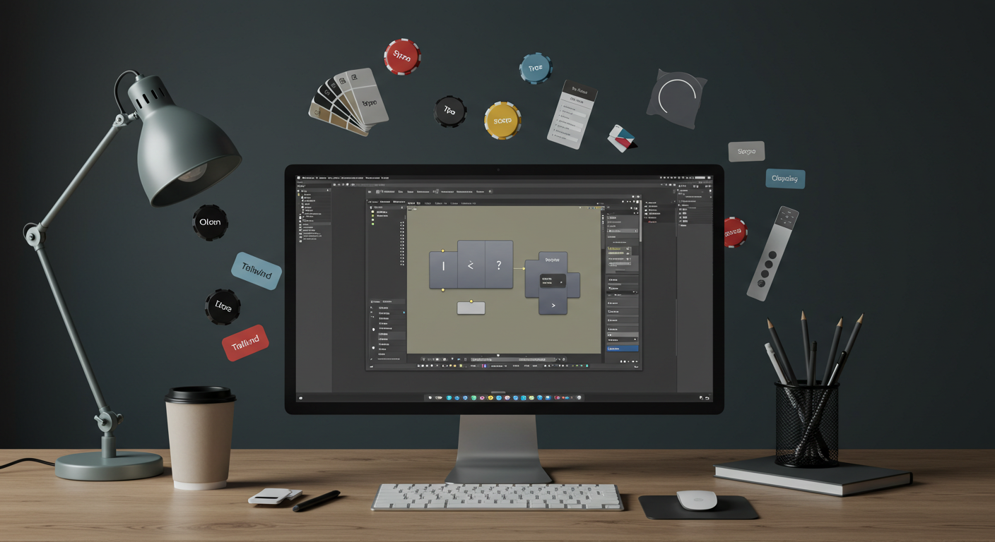
Token-based styling with Tailwind + Gutenberg for scalable brands (with code)
What you’ll build
- Design tokens (color, type, spacing, radius, shadows, motion) as a single source of truth.
- Tailwind that “speaks” your tokens (so builders move fast without ad-hoc CSS).
- Gutenberg (WordPress block editor) that exposes curated choices to authors via
theme.json, block styles, and block patterns. - Style variations for brand/dark/campaign modes—no rewrites.
This isn’t theory. You’ll leave with a working block theme skeleton you can drop into /wp-content/themes/ and extend.
0) Prereqs
- WordPress 6.3+ (block theme capable).
- Node 18+ for Tailwind/PostCSS build.
- Basic WP theme familiarity (themes, patterns,
functions.php).
1) Project layout
tokenwp/
├─ style.css                  # WP theme header (block theme)
├─ theme.json                 # Global Styles (palette/typography/spacing)
├─ functions.php              # Enqueue CSS, register patterns & styles
├─ patterns/
│  ├─ hero.php                # Example hero block pattern
│  └─ proof-logos.php         # Example proof/logo belt pattern
├─ styles/
│  └─ brand-dark.json         # Optional style variation (dark/alt brand)
├─ assets/
│  └─ main.css                # Built Tailwind CSS (front + editor)
├─ src/
│  ├─ tokens.css              # :root CSS variables generated from tokens
│  └─ main.css                # Tailwind entry (@tailwind base/components/utilities)
├─ tokens/
│  └─ design-tokens.json      # Your single source of truth
├─ scripts/
│  └─ build-tokens.js         # Generates src/tokens.css from JSON tokens
├─ tailwind.config.cjs
├─ postcss.config.cjs
└─ package.json
2) Define your tokens (single source of truth)
Store “final” values here. We’ll generate CSS variables for runtime + feed Tailwind’s theme.
tokens/design-tokens.json
{
  "color": {
    "primary": { "50": "239 246 255", "100": "219 234 254", "200": "191 219 254", "300": "147 197 253", "400": "96 165 250", "500": "59 130 246", "600": "37 99 235", "700": "29 78 216", "800": "30 64 175", "900": "30 58 138" },
    "accent":  { "50": "255 245 235", "100": "254 230 200", "200": "253 211 141", "300": "251 191 36",  "400": "245 158 11",  "500": "234 88 12",  "600": "194 65 12",  "700": "154 52 18",  "800": "124 45 18",  "900": "101 31 14" },
    "neutral": { "50": "249 250 251", "100": "243 244 246", "200": "229 231 235", "300": "209 213 219", "400": "156 163 175", "500": "107 114 128", "600": "75 85 99",   "700": "55 65 81",   "800": "31 41 55",   "900": "17 24 39" }
  },
  "typography": {
    "fontFamily": { "sans": "Inter, ui-sans-serif, system-ui, -apple-system, Segoe UI, Roboto, Helvetica, Arial, Apple Color Emoji, Segoe UI Emoji", "mono": "ui-monospace, SFMono-Regular, Menlo, Monaco, Consolas, Liberation Mono, Courier New, monospace" },
    "scale": { "xs": "12px", "sm": "14px", "base": "16px", "lg": "18px", "xl": "20px", "2xl": "24px", "3xl": "30px", "4xl": "36px", "5xl": "48px" },
    "lineHeight": { "tight": "1.2", "snug": "1.35", "normal": "1.5" }
  },
  "spacing": { "0": "0px", "1": "4px", "2": "8px", "3": "12px", "4": "16px", "6": "24px", "8": "32px", "12": "48px", "16": "64px" },
  "radius":  { "none": "0px", "sm": "4px", "md": "8px", "lg": "12px", "xl": "16px", "full": "9999px" },
  "shadow":  { "sm": "0 1px 2px 0 rgb(0 0 0 / 0.06)", "md": "0 4px 6px -1px rgb(0 0 0 / 0.1), 0 2px 4px -2px rgb(0 0 0 / 0.1)", "lg": "0 15px 30px -10px rgb(0 0 0 / 0.25)" },
  "motion":  { "duration": { "fast": "150ms", "base": "250ms", "slow": "400ms" }, "easing": { "standard": "cubic-bezier(0.2,0,0,1)" } }
}
3) Generate CSS variables from tokens
We keep colors as space-separated RGB so Tailwind can apply alpha:
rgb(var(--color-primary-600) / <alpha-value>).
scripts/build-tokens.js
const fs = require('fs');
const path = require('path');
const tokens = require('../tokens/design-tokens.json');

const out = [];
out.push(':root{');

/** colors -> --color-primary-600: 37 99 235; */
for (const [family, scale] of Object.entries(tokens.color)) {
  for (const [step, rgb] of Object.entries(scale)) {
    out.push(`--color-${family}-${step}: ${rgb};`);
  }
}

/** typography */
out.push(`--font-sans: ${tokens.typography.fontFamily.sans};`);
out.push(`--font-mono: ${tokens.typography.fontFamily.mono};`);
for (const [k, v] of Object.entries(tokens.typography.scale)) {
  out.push(`--text-${k}: ${v};`);
}
for (const [k, v] of Object.entries(tokens.typography.lineHeight)) {
  out.push(`--leading-${k}: ${v};`);
}

/** spacing, radii, shadows, motion */
for (const [k, v] of Object.entries(tokens.spacing)) out.push(`--space-${k}: ${v};`);
for (const [k, v] of Object.entries(tokens.radius))  out.push(`--radius-${k}: ${v};`);
for (const [k, v] of Object.entries(tokens.shadow))  out.push(`--shadow-${k}: ${v};`);
for (const [k, v] of Object.entries(tokens.motion.duration)) out.push(`--duration-${k}: ${v};`);
for (const [k, v] of Object.entries(tokens.motion.easing))   out.push(`--easing-${k}: ${v};`);

out.push('}');

const dest = path.join(__dirname, '../src/tokens.css');
fs.writeFileSync(dest, out.join('\n'));
console.log('✓ Generated', path.relative(process.cwd(), dest));
Run once:
node scripts/build-tokens.js
src/tokens.css (generated) will look like:
:root{
  --color-primary-600: 37 99 235;
  /* ...many more... */
  --radius-md: 8px;
  --shadow-md: 0 4px 6px -1px rgb(0 0 0 / 0.1), 0 2px 4px -2px rgb(0 0 0 / 0.1);
  --duration-base: 250ms;
  --easing-standard: cubic-bezier(0.2,0,0,1);
}
4) Tailwind that “speaks” tokens
tailwind.config.cjs
/** Helper to map CSS variables with optional opacity */
function colorVar(name) {
  return ({ opacityValue } = {}) =>
    opacityValue === undefined ? `rgb(var(${name}))` : `rgb(var(${name}) / ${opacityValue})`;
}

module.exports = {
  content: [
    './*.php',
    './patterns/**/*.php',
    './**/*.html',
    './**/*.js'
  ],
  theme: {
    extend: {
      colors: {
        primary: {
          50:  colorVar('--color-primary-50'),
          100: colorVar('--color-primary-100'),
          200: colorVar('--color-primary-200'),
          300: colorVar('--color-primary-300'),
          400: colorVar('--color-primary-400'),
          500: colorVar('--color-primary-500'),
          600: colorVar('--color-primary-600'),
          700: colorVar('--color-primary-700'),
          800: colorVar('--color-primary-800'),
          900: colorVar('--color-primary-900')
        },
        accent: {
          400: colorVar('--color-accent-400'),
          500: colorVar('--color-accent-500'),
          600: colorVar('--color-accent-600')
        },
        neutral: {
          50:  colorVar('--color-neutral-50'),
          100: colorVar('--color-neutral-100'),
          200: colorVar('--color-neutral-200'),
          300: colorVar('--color-neutral-300'),
          400: colorVar('--color-neutral-400'),
          500: colorVar('--color-neutral-500'),
          600: colorVar('--color-neutral-600'),
          700: colorVar('--color-neutral-700'),
          800: colorVar('--color-neutral-800'),
          900: colorVar('--color-neutral-900')
        }
      },
      fontFamily: {
        sans: 'var(--font-sans)',
        mono: 'var(--font-mono)'
      },
      fontSize: {
        xs:  ['var(--text-xs)',  'var(--leading-normal)'],
        sm:  ['var(--text-sm)',  'var(--leading-normal)'],
        base:['var(--text-base)','var(--leading-normal)'],
        lg:  ['var(--text-lg)',  'var(--leading-snug)'],
        xl:  ['var(--text-xl)',  'var(--leading-snug)'],
        '2xl':['var(--text-2xl)','var(--leading-tight)'],
        '3xl':['var(--text-3xl)','var(--leading-tight)'],
        '4xl':['var(--text-4xl)','var(--leading-tight)'],
        '5xl':['var(--text-5xl)','var(--leading-tight)']
      },
      spacing: {
        0: 'var(--space-0)', 1: 'var(--space-1)', 2: 'var(--space-2)', 3: 'var(--space-3)',
        4: 'var(--space-4)', 6: 'var(--space-6)', 8: 'var(--space-8)', 12: 'var(--space-12)', 16: 'var(--space-16)'
      },
      borderRadius: {
        none: 'var(--radius-none)', sm: 'var(--radius-sm)', md: 'var(--radius-md)',
        lg: 'var(--radius-lg)', xl: 'var(--radius-xl)', full: 'var(--radius-full)'
      },
      boxShadow: {
        sm: 'var(--shadow-sm)', md: 'var(--shadow-md)', lg: 'var(--shadow-lg)'
      },
      transitionDuration: {
        150: 'var(--duration-fast)', 250: 'var(--duration-base)', 400: 'var(--duration-slow)'
      },
      transitionTimingFunction: {
        standard: 'var(--easing-standard)'
      },
      container: {
        center: true,
        padding: { DEFAULT: '1rem', lg: '2rem' }
      }
    }
  },
  plugins: []
};
src/main.css
@import "./tokens.css";

/* Tailwind layers */
@tailwind base;
@tailwind components;
@tailwind utilities;

/* Base typography using tokens */
@layer base {
  html { font-family: var(--font-sans); color: rgb(var(--color-neutral-900)); }
  body { background: rgb(var(--color-neutral-50)); }
  a { color: rgb(var(--color-primary-600)); }
}

/* Example component classes (optional) */
@layer components {
  .btn-primary{
    @apply inline-flex items-center justify-center rounded-md px-4 py-2 text-white
           bg-primary-600 hover:bg-primary-700 transition duration-250 ease-standard shadow-sm;
  }
  .card{
    @apply rounded-lg bg-white shadow-sm ring-1 ring-neutral-200;
  }
}
postcss.config.cjs
module.exports = { plugins: { tailwindcss: {}, autoprefixer: {} } };
package.json
{
  "name": "tokenwp",
  "private": true,
  "scripts": {
    "tokens": "node scripts/build-tokens.js",
    "dev": "npm run tokens && tailwindcss -i ./src/main.css -o ./assets/main.css -w",
    "build": "npm run tokens && tailwindcss -i ./src/main.css -o ./assets/main.css --minify"
  },
  "devDependencies": {
    "autoprefixer": "^10.4.20",
    "tailwindcss": "^3.4.12"
  }
}
Build:
npm install
npm run build
5) WordPress block theme shell
style.css
/*
Theme Name: TokenWP
Author: Your Name
Version: 1.0.0
Requires at least: 6.3
*/
functions.php
<?php
/**
 * TokenWP theme setup
 */
add_action('after_setup_theme', function () {
  add_theme_support('editor-styles');
  add_editor_style('assets/main.css'); // Tailwind in editor
});

add_action('wp_enqueue_scripts', function () {
  wp_enqueue_style('tokenwp-main', get_template_directory_uri() . '/assets/main.css', [], '1.0');
});

/** Register block style variants (mapped to Tailwind classes via editor className) */
add_action('init', function () {
  register_block_style('core/button', [
    'name'  => 'primary',
    'label' => __('Primary', 'tokenwp'),
    'inline_style' => '.is-style-primary .wp-block-button__link{ @apply bg-primary-600 hover:bg-primary-700 text-white rounded-md; }'
  ]);
});

/** Pattern categories */
add_action('init', function () {
  register_block_pattern_category('tokenwp', ['label' => __('TokenWP Patterns', 'tokenwp')]);
});

/** Load pattern files (simple require) */
foreach (glob(get_theme_file_path('/patterns/*.php')) as $pattern) {
  require $pattern;
}
Note:
@applyinsideinline_styleis illustrative; many teams either (a) precompile pattern classes into the main CSS, or (b) write plain CSS there. To keep things portable, we’ll use classes already defined inassets/main.css(e.g.,.btn-primary,.card) inside patterns.
6) Global Styles (theme.json) that mirror tokens
We expose a curated palette and type presets to Gutenberg so authors choose on-brand options.
theme.json
{
  "version": 2,
  "settings": {
    "appearanceTools": true,
    "color": {
      "palette": [
        { "slug": "primary-600", "name": "Primary", "color": "#2563eb" },
        { "slug": "accent-500",  "name": "Accent",  "color": "#ea580c" },
        { "slug": "neutral-900", "name": "Text",    "color": "#111827" },
        { "slug": "neutral-50",  "name": "Base",    "color": "#f9fafb" }
      ],
      "defaultPalette": false
    },
    "typography": {
      "fontFamilies": [
        { "slug": "sans", "name": "Inter (System)", "fontFamily": "Inter, ui-sans-serif, system-ui, -apple-system, Segoe UI, Roboto, Helvetica, Arial, Apple Color Emoji, Segoe UI Emoji" }
      ],
      "defaultFontSizes": false,
      "fontSizes": [
        { "slug": "sm",   "name": "Small",  "size": "14px" },
        { "slug": "base", "name": "Base",   "size": "16px" },
        { "slug": "lg",   "name": "Large",  "size": "18px" },
        { "slug": "xl",   "name": "XL",     "size": "20px" },
        { "slug": "2xl",  "name": "2XL",    "size": "24px" },
        { "slug": "3xl",  "name": "3XL",    "size": "30px" }
      ]
    },
    "spacing": {
      "units": [ "px", "em", "rem", "%" ],
      "padding": true,
      "margin": true
    },
    "custom": {
      "tokens": "CSS variables are in assets/main.css; this area is a note for your team."
    }
  },
  "styles": {
    "color": { "background": "#f9fafb", "text": "#111827" },
    "typography": {
      "fontFamily": "Inter, ui-sans-serif, system-ui, -apple-system, Segoe UI, Roboto, Helvetica, Arial, Apple Color Emoji, Segoe UI Emoji",
      "lineHeight": "1.5"
    },
    "blocks": {
      "core/button": {
        "border": { "radius": "8px" }
      }
    }
  },
  "templateParts": [],
  "patterns": []
}
Gutenberg’s palette needs hex values; we duplicate a subset of token colors here for editor controls. Runtime still uses CSS vars via Tailwind.
7) A real hero pattern (authors can insert this)
patterns/hero.php
<?php
/**
 * Title: Hero (Promise + CTA)
 * Slug: tokenwp/hero
 * Categories: tokenwp
 * Block Types: core/group
 * Inserter: yes
 */
?>
<!-- wp:group {"align":"full","style":{"spacing":{"padding":{"top":"64px","bottom":"64px"}}},"className":"bg-neutral-50"} -->
<div class="wp-block-group alignfull bg-neutral-50" style="padding-top:64px;padding-bottom:64px">
  <!-- wp:group {"layout":{"type":"constrained","contentSize":"1100px"}} -->
  <div class="wp-block-group">
    <!-- wp:columns {"verticalAlignment":"center"} -->
    <div class="wp-block-columns are-vertically-aligned-center">
      <!-- wp:column {"verticalAlignment":"center"} -->
      <div class="wp-block-column is-vertically-aligned-center">
        <!-- wp:heading {"level":1,"style":{"typography":{"fontSize":"36px","lineHeight":"1.2"}}} -->
        <h1 style="font-size:36px;line-height:1.2">Launch a conversion-ready site in 21 days</h1>
        <!-- /wp:heading -->

        <!-- wp:paragraph {"style":{"typography":{"fontSize":"18px"}}} -->
        <p style="font-size:18px">Speed, SEO, and design—done for you with a battle-tested framework built on tokens, Tailwind, and Gutenberg.</p>
        <!-- /wp:paragraph -->

        <!-- wp:buttons {"style":{"spacing":{"margin":{"top":"16px"}}}} -->
        <div class="wp-block-buttons" style="margin-top:16px">
          <!-- wp:button {"className":"btn-primary"} -->
          <div class="wp-block-button"><a class="wp-block-button__link wp-element-button btn-primary">Get a Quote</a></div>
          <!-- /wp:button -->
          <!-- wp:button {"className":"is-style-outline"} -->
          <div class="wp-block-button is-style-outline"><a class="wp-block-button__link wp-element-button">See Pricing</a></div>
          <!-- /wp:button -->
        </div>
        <!-- /wp:buttons -->

        <!-- wp:paragraph {"style":{"typography":{"fontSize":"14px"},"color":{"text":"#6b7280"}}} -->
        <p style="font-size:14px;color:#6b7280">No hard sales pitch—just a 15-minute scope call.</p>
        <!-- /wp:paragraph -->
      </div>
      <!-- /wp:column -->

      <!-- wp:column {"verticalAlignment":"center"} -->
      <div class="wp-block-column is-vertically-aligned-center">
        <!-- wp:image {"sizeSlug":"large","linkDestination":"none","className":"card"} -->
        <figure class="wp-block-image size-large card"><img alt="UI preview placeholder"/></figure>
        <!-- /wp:image -->
      </div>
      <!-- /wp:column -->
    </div>
    <!-- /wp:columns -->
  </div>
  <!-- /wp:group -->
</div>
<!-- /wp:group -->
This pattern uses classes you defined in Tailwind (.btn-primary, .card) and remains editor-friendly.
FAQ
What is a token-based design system in WordPress?
It’s a single set of named decisions—color, type, spacing, radius, elevation—that flow into Tailwind utilities and Gutenberg Global Styles, keeping every page consistent and fast.
Why use Tailwind with Gutenberg?
Tailwind turns tokens into quick, composable utilities for builders, while Gutenberg exposes curated, brand-safe controls and patterns for editors—speed plus safety.
How do Global Styles fit in?
Global Styles (theme.json) present your tokens in human terms—palettes, typography, spacing—so editors select approved options without touching code.
Can this support multiple brands or regions?
Yes. Keep a shared base token set and switch brand overlays via style variations. Structure stays the same; token values change.
What about performance and accessibility?
Tokenized decisions reduce CSS bloat and layout shift; consistent contrasts, focus states, and type scales are enforced system-wide for better a11y.